Tripling lead conversions on mobile
Inca Expert's mobile enquiry form was the first point of contact for every lead, and where most of them dropped off.
I redesigned it as a mobile-first wizard.
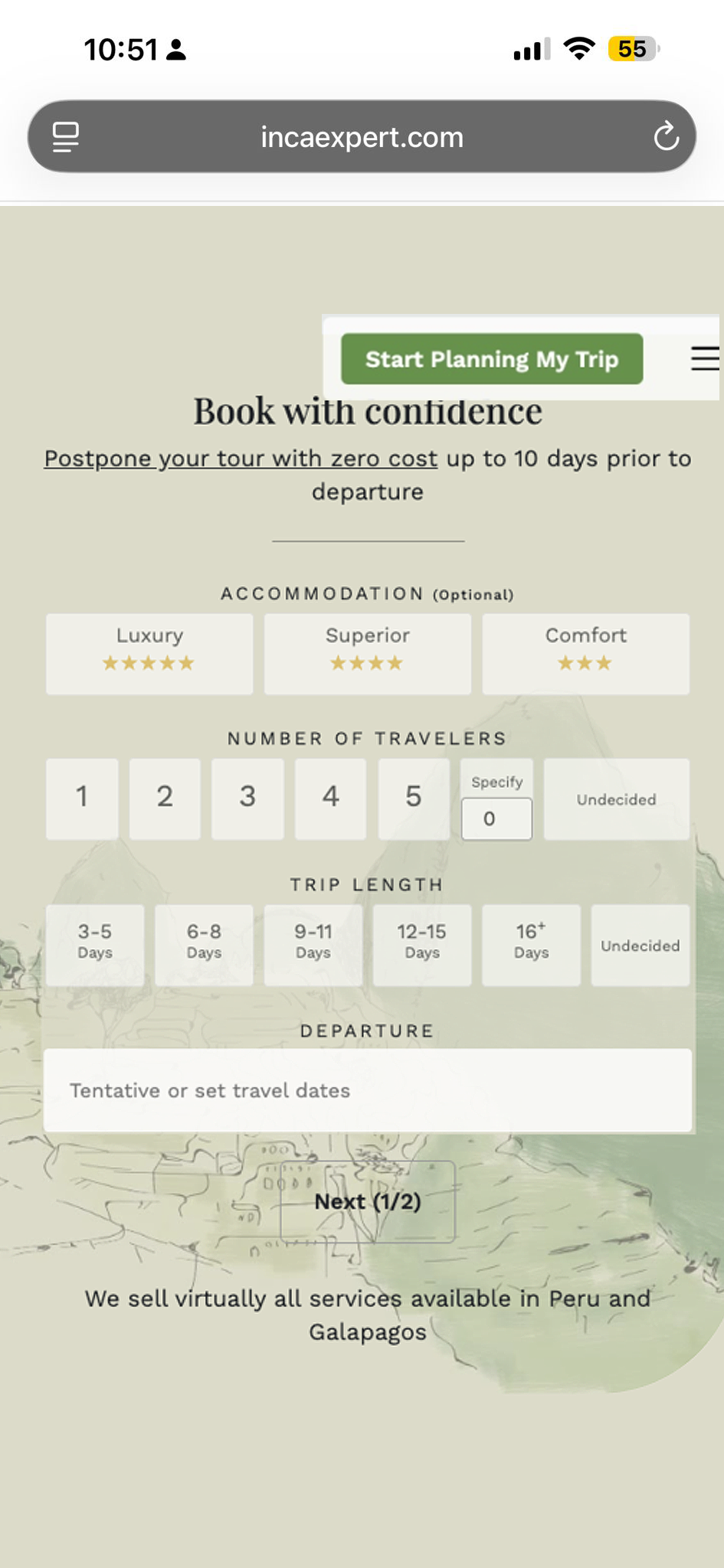 ORIGINAL ENQUIRY FORM
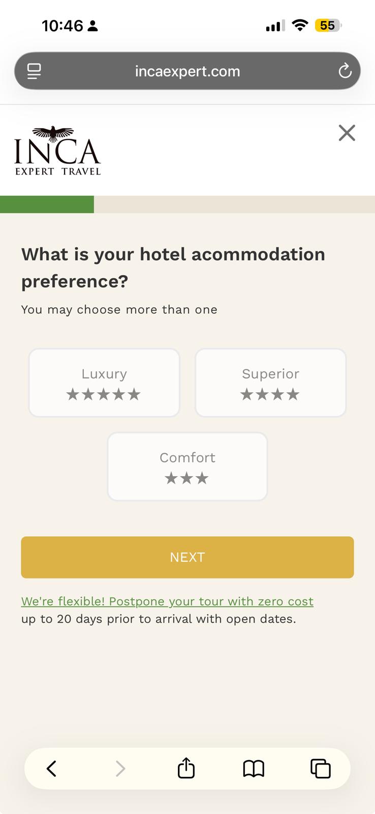 REDESIGNED GUIDED WIZARD
70% of mobile users dropped off before even reaching a Travel Advisor
Inca Expert connects travellers with Travel Advisors to build custom Peru itineraries, and the mobile enquiry form was the business's main source of qualified leads. Analytics showed a brutal 70% mobile drop-off almost immediately after landing on it.
The form was a desktop-first layout crammed onto a phone screen: too many fields and decisions at once, with no sense of progress. Small text, overlapping interface elements, and distracting background imagery made the form frustrating to use on mobile, causing users to abandon before contacting a Travel Advisor.
How might we turn an inaccessible mobile form into a frictionless, conversational booking experience?
Original mobile enquiry form — all fields presented on one long screen
With no formal testing budget, I found real prospective travellers, watched them struggle firsthand, and moved straight from insight into a redesigned flow.
Recruited 5 travellers planning Peru trips from a backpacker community and watched them use the original form live.
Mistapped dropdowns and cramped tier options made a premium trip feel like filling out a tax form.
Mapped the form into a step-by-step flow: one clear decision, and one thumb-sized interaction, per screen.
Refined tap targets and tier presentation, with dev turning it around quickly ahead of launch.
A wizard, one decision at a time
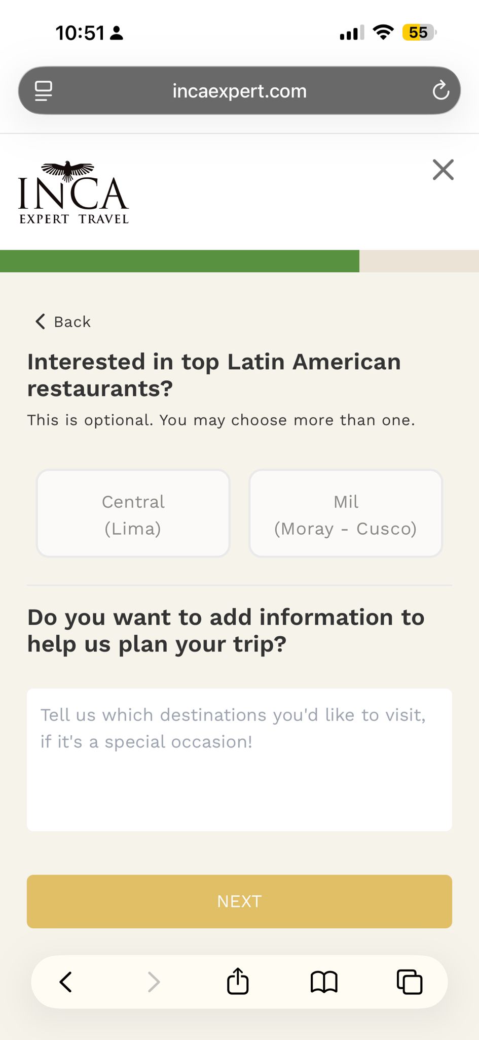
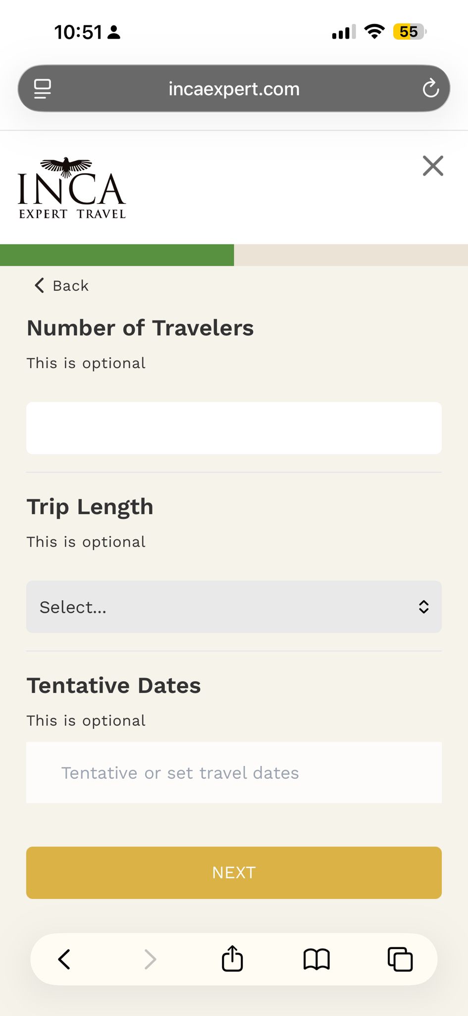
The form became a guided sequence. Each screen built for thumbs, not clicks, so the experience feels like a conversation rather than paperwork.
→
 →
→
A single, visual tap-to-choose question — Luxury, Superior, or Comfort.
Optional add-ons surfaced only after the core decisions, never blocking progress.
Trip duration, traveller count, and dates simplified into thumb-friendly targets.
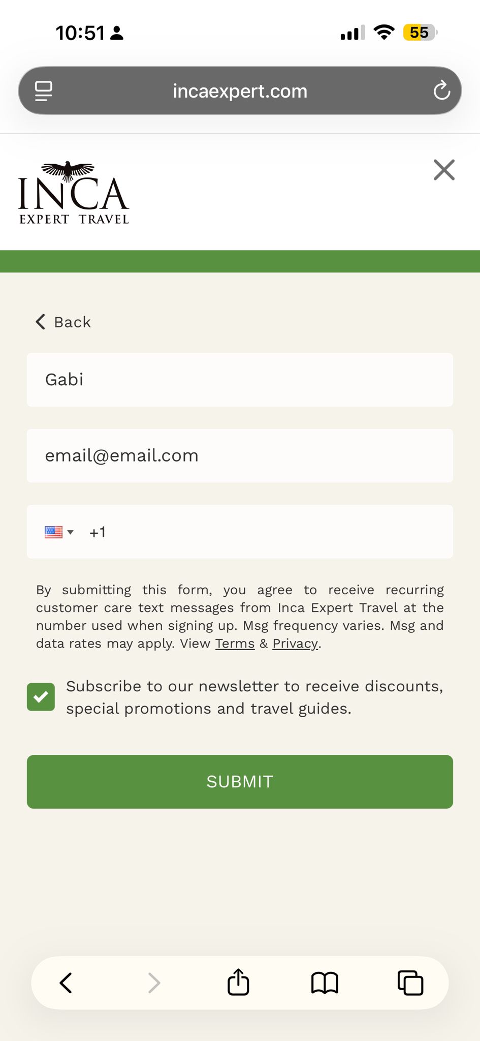
Asked last, once the user had already made positive choices and felt invested.
Measured through post-launch analytics and A/B testing against the previous enquiry form.
The biggest insight was that conversion problems are often confidence problems. By replacing a form heavy experience with a guided journey, we reduced uncertainty and created a smoother path from interest to enquiry.