Making 800+ holiday deals easier to discover
Most visitors land here without a destination in mind yet. I restructured the experience around exploration, making a large collection of deals easier to navigate, then validated the impact through A/B testing.
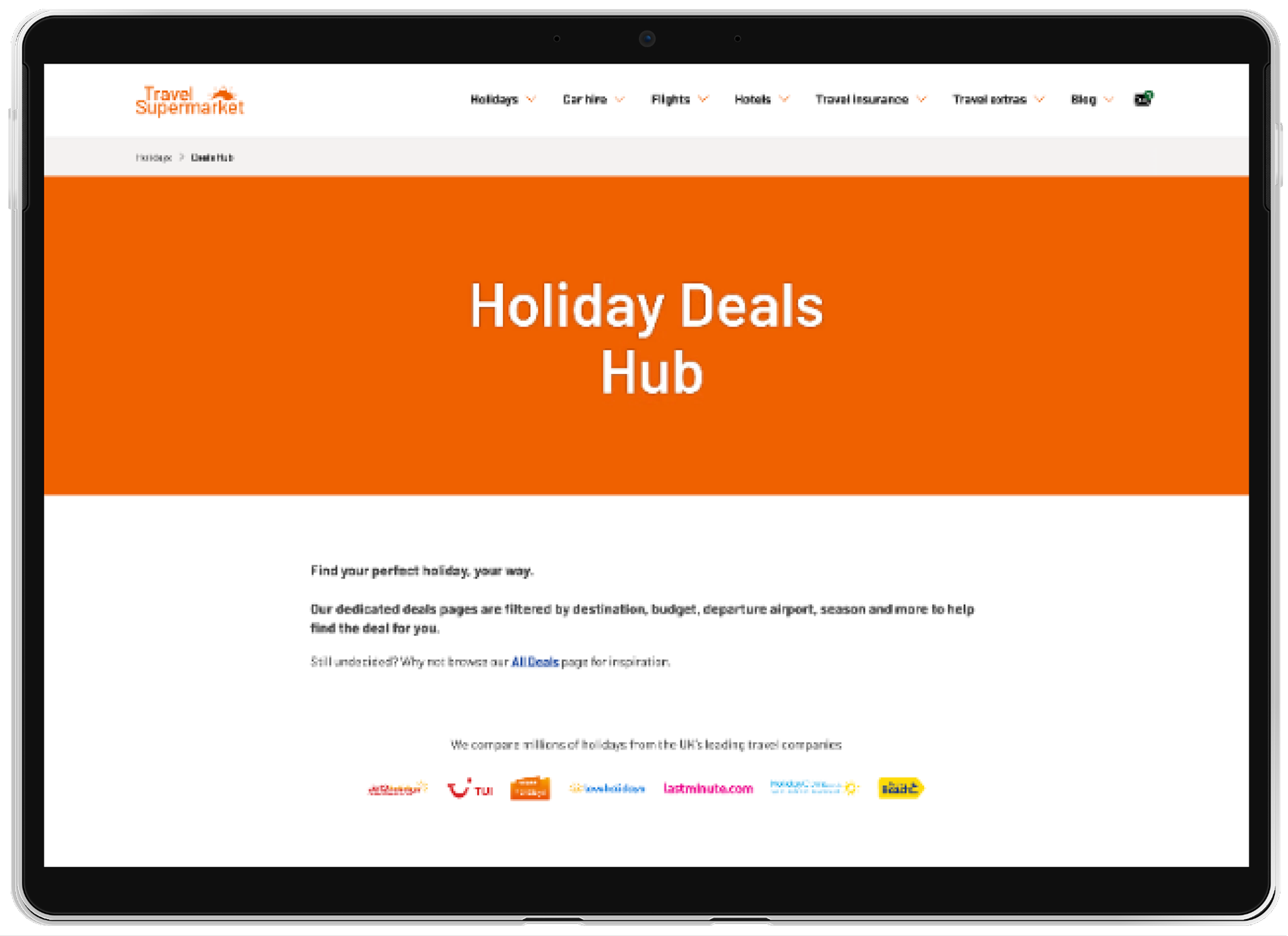
Users could find deals, but discovering them was difficult
The Deals Portal is the primary landing page for paid marketing traffic, every visitor arrives at a media cost, so how well the page converts that traffic directly affects return on ad spend.
The original experience was a long scrolling page made up of repeated components. Every deal category looked the same on the page, so nothing told users where to look first. They had to scan the whole experience to find what applied to them. Users could find individual deals, but the experience did not fully support inspiration-led browsing.
Three decisions shaped the direction of the redesign:
Most holiday shoppers don't know where or when they want to go yet. They are still exploring possibilities rather than looking for a specific deal. The challenge was helping users make sense of the available options and navigate the page more easily.
Restructured the page hierarchy around the categories users were already browsing, giving each section clearer purpose and making the experience easier to scan.
This was a restructuring problem, not a feature problem. The opportunity wasn't adding more functionality, it was helping users navigate the options already available. The redesign was launched as an A/B test to validate whether these structural changes improved performance.
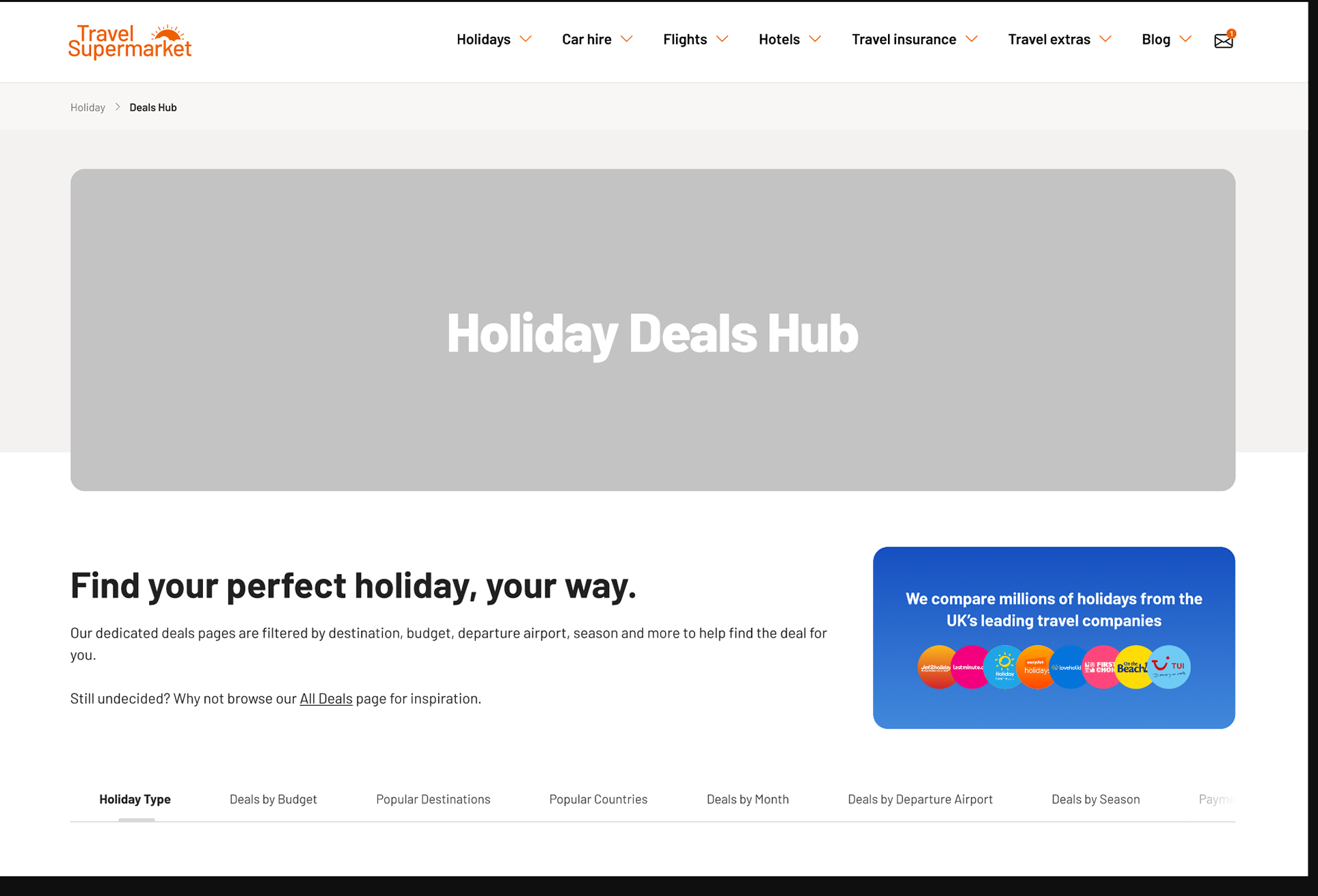 First pass: testing whether grouping deals into named categories alone would shorten the path to a relevant deal, before investing in visual polish.
A clearer way to browse holiday deals
The redesign focused on reducing friction in a content heavy experience. By shortening the hero to bring key information into view sooner, introducing sticky navigation, and creating a clearer hierarchy between deal sections.
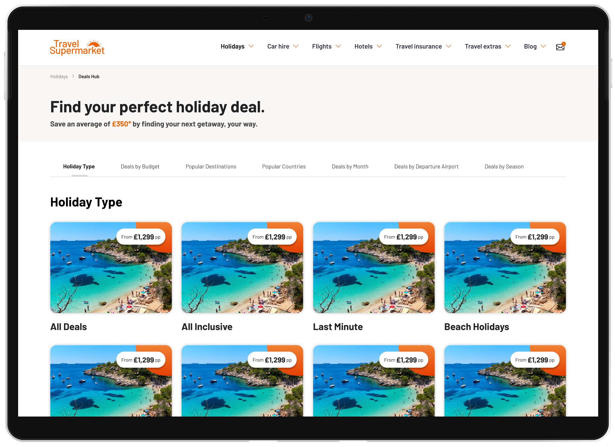
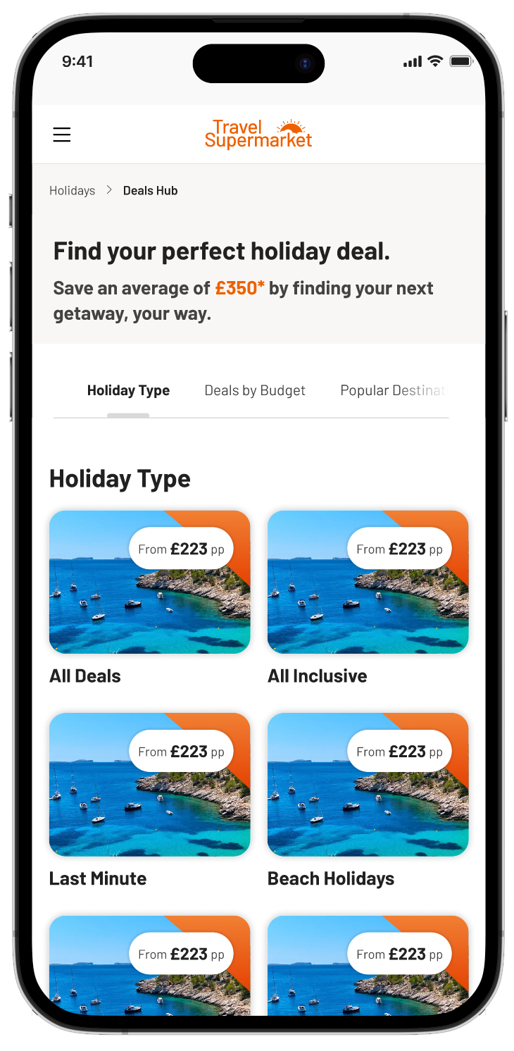
FINAL DESIGN — DESKTOP + MOBILE
Every component had equal weight before. Named, ranked categories gave users a clearer structure to scan instead of a wall of repeated sections.
The experience was designed mobile-first, with denser card layouts and simpler interactions. Departure airport lists became dropdowns to reduce scrolling and improve scanability.
Validated through A/B testing
The redesigned Deals Portal was iterated and validated through A/B testing against the previous live version.
The uplift came from improving how users navigated and understood the available deals, through stronger hierarchy, reduced scroll depth, and more effective mobile patterns.
Both versions shared some underlying Sanity components, meaning some improvements were already present across both experiences. This gave us a more conservative measure of the redesign’s impact.
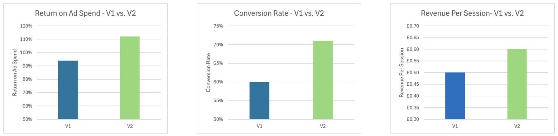
A/B test results comparing the updated Deals Portal experience against the previous live version.
The biggest takeaway was that users don’t always need more options, they need clearer ways to understand the options already available. Improving the structure of the experience had more impact than adding new functionality.